User-centric digital experiences now influence how visitors use a website and how well its content performs in search. SEO people used to leave design decisions to designers. The logic was simple enough: marketers handled rankings, developers fixed the technical issues, and the visual side came afterward. For a while, that separation worked.
It does not work nearly as well today. Someone can open a page with strong content and still close it almost immediately because the site feels slow, crowded, or annoying to use. A confusing menu can do more damage than a missing keyword. The same goes for tiny mobile text, shifting layouts, and buttons that seem to react a second too late.
This changes the way businesses need to think about organic search. Reaching the first page is only one part of the job. The page also has to earn the visitor’s attention once the click happens. When it fails there, all the optimization behind it matters a lot less.
User-centric digital experiences support SEO by improving speed, mobile usability, navigation, and engagement. When visitors can find information easily and interact with a page without friction, the website is more likely to perform well in search.
Table of Contents
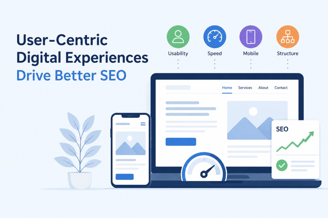
Essential Elements for a High-Performing Interface
Building a robust digital foundation that satisfies both human users and search crawlers requires a highly strategic approach to visual and functional architecture. This is where investing in professional UX UI Design becomes absolutely critical for businesses aiming to keep organic traffic actively engaged.
A well-structured, user-friendly interface ensures that information is exceptionally easy to find, text is highly readable, and the overall browsing journey feels natural and intuitive rather than chaotic.
Check the same website on a laptop and then on your phone. The difference can be brutal. A layout that looked clean a minute ago may now have cramped text, hard-to-tap links, and a menu that takes up most of the screen. Sometimes the page technically works, but using it still feels like a chore.
Google sees the mobile version first when it crawls and indexes a page. Your visitors often do too. They will not give the site extra credit because the desktop version looks better. They see what is in front of them: a slow page, an image that will not settle, or a button hidden under another element.
Speed makes those flaws harder to ignore. Google found that 53 percent of mobile visits end when loading takes longer than three seconds. Anyone who has waited for a page to load on a weak connection knows that three seconds rarely feels like enough.
So test the page with your own hands. Try the menu. Open a form. Tap the smallest link. Read a few paragraphs without zooming. That tells you far more than simply resizing a browser window and calling the site mobile-friendly.
The Undeniable Link Between Experience and Rankings
Google wants each result to answer the query and work properly once the page opens. A relevant article can still disappoint the visitor when the layout shifts, the main content loads too slowly, or the page ignores the first click. Google’s guidance makes that point clearly: its ranking systems favor useful content that comes with a good page experience.
Core Web Vitals measure part of that experience. They track how quickly the main content appears, how fast the page responds, and whether elements move while the visitor tries to read or tap something. These metrics do not control rankings on their own. They simply reveal problems that can weaken a page before the content gets a chance to help anyone.
User-centric digital experiences support stronger SEO results by helping visitors use the page without fighting the layout.
Visitors notice those problems almost at once. One study found that people can form an opinion about a website’s appearance in about 50 milliseconds. They have not read the headline yet, but they may already see the page as trustworthy, dated, polished, or careless. A poor first visit also gives them little reason to come back.
The pattern feels familiar. Someone clicks a result, waits for the page to settle, fights with the layout, and goes back to Google. Marketers often refer to that behavior as pogo-sticking, although Google does not confirm it as a simple ranking signal. The label matters less than the outcome: good content struggles when the website gets in the visitor’s way.
Strategies to Align Design with Organic Growth
Start with the parts of the site that people actually touch. Open the menu. Click the main buttons. Try the contact form. Move from the homepage to a service page and then back again. These simple checks often reveal more than a long technical audit because they show where the experience starts to break down.
Interaction speed deserves close attention. When someone taps a button or opens a menu, the page should react almost immediately. Interaction to Next Paint measures that delay, and a response time under 200 milliseconds gives the user clear feedback that the site registered the action. Anything slower can make the page feel unresponsive, even when it technically still works.
Navigation creates another common problem. Visitors should not have to guess where you placed an important service, product, or contact page. Keep the structure shallow, use clear labels, and make the next step obvious. The old three-click rule is not absolute, but it still offers a useful test: if a key page is too hard to reach, people may stop looking.
Images often cause delays that the design team barely notices on a fast office connection. Large files, oversized dimensions, and unnecessary background graphics can slow the first view of the page. Compress each image, serve it at the size the layout actually uses, and choose formats such as WebP or AVIF where they make sense. A small delay may look harmless in a speed report, but several small delays together can make the whole page feel heavy.
Mobile controls need the same kind of practical testing. Tap every link with your thumb. Check the spacing around buttons. Make sure a sticky banner does not cover the form or menu. A layout can pass a responsive test and still annoy anyone who tries to use it with one hand.
None of these fixes works in isolation. Faster interactions make the site feel more reliable. Clearer navigation helps people continue reading. Lighter images reduce the wait before the page becomes usable. Better spacing reduces accidental taps.
Forrester has linked UX investment with strong returns, although the widely repeated $100 return for every $1 spent should not be treated as a guarantee for every company. The more useful point is easier to defend: when a site removes friction, more visitors reach the pages, forms, and products that matter. That gives the content a better chance to perform, both for the business and in search.
Over time, user-centric digital experiences can help useful content earn more attention, better engagement, and steadier search visibility.
How does user experience affect SEO?
User experience affects how easily visitors can read, navigate, and interact with a website.
Faster pages, clear navigation, and stable layouts give useful content a better chance to perform well in search.
Does Google use Core Web Vitals as ranking signals?
Google uses Core Web Vitals as part of its broader page experience evaluation.
They do not determine rankings alone, but they can reveal loading, responsiveness, and layout problems that make a page harder to use.
Why does mobile design matter for SEO?
Google primarily uses the mobile version of a page when it crawls and indexes content.
Small text, overlapping buttons, slow images, or difficult menus can weaken the experience for both visitors and search engines.
What is Interaction to Next Paint?
Interaction to Next Paint, or INP, measures how quickly a page responds after someone clicks, taps, or uses a keyboard control.
A good INP score helps menus, forms, and buttons feel responsive instead of delayed or broken.
Which UX improvements can support better SEO results?
Start by improving page speed, mobile controls, navigation, image sizes, and interaction response times.
These changes remove obstacles that stop visitors from reading, exploring the site, or completing an important action.

Andrej Fedek is the creator and one-person owner of three blogs: InterCool Studio, CareersMomentum, and Bettegi. As an experienced marketer, he is driven by turning leads into customers with White Hat SEO techniques. Besides being a boss, he is a real team player with a great sense of equality.