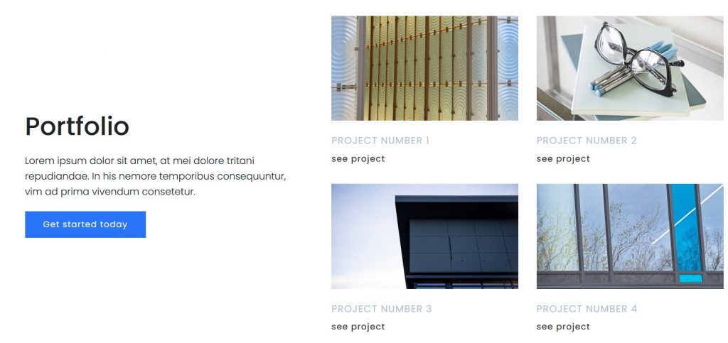
The Landing Page page has a multitude of advantages, one of which is to convert visitors into potential customers. Therefore, increased attention to it is recommended in the marketing strategy.
A campaign that has use a destination page can be sure that it will attract consumers and convince them to carry out an action that contributes to the proposed objective.
Well, if you didn’t know, a landing page is a page that “lands” Internet users after accessing a link, whether it was generated by a Google search, is from a banner, a PPC campaign ( Pay per click), or from a marketing email campaign. A landing page is a place where you have the opportunity to convince the Internet user and convert it into a buyer.
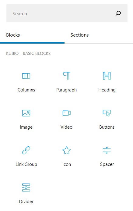
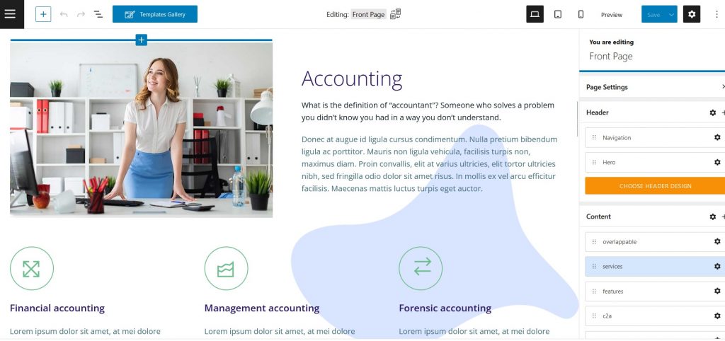
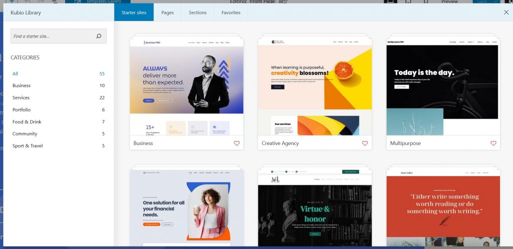
The page must contain a targeted message to a certain category of audience. For this reason, when building such a landing page, you must consider the buyer’s perspective, interests, and problems and come up with an attractive solution. In your long experience, you certainly came across a few models of landing pages, some more successful, which have captured your attention, others less successful, who did not convince you to pay them your attention. You can easily create a landing page using Kubiobuilder. This awesome plugin is built on Gutenberg and it gives you the ability to create custom landing pages and pages using one single interface. With over 50+ prebuilt templates you can choose from them, Kubiobuilder is the right tool when it comes to site building.
What does a Landing Page look like?
Here are some suggestions about what a landing page should contain to be useful:
Convincing titles – they must clearly specify the mission of the offer and highlight the benefit. It is also very important that the title induces the action-to start with an action verb (e.g. download, learn, benefit, sign up, etc.) and to do an immediate action (now!).
Clear, well-organized text-the text of a landing page must be consistent, airy, and … fit on a page. Together with the title, he must motivate the visitor enough to act. It is good to present only the clear characteristics and benefits of the offer, without trying to impress. Direct his attention to the command:
Uses testimonials – the testimonies of satisfied customers and their names can do wonders for the efficiency of a landing page;
Use a simple image to present the product/ service;
Use bullets and bold-using 3-5 bullets you can best highlight the benefits of the product; Equally attractive to the user’s eye is the boldness of important words;
Organizes information into columns-for a better structure divides information into 2-3 columns;
The registration/ control/ download form must be short, in order not to discourage the visitor;
Use “now” to encourage immediate action: see now! , Purchase now!
A few links-the destination pages should not contain links to other pages of the site, in order not to distract the visitor’s attention from the initial purpose-to buy. The only link on the page should be the purchase.
Incorporate the social media elements on the page – add the Facebook, and Twitter buttons, etc. On the page and so you shoot more rabbits with one page.
A destination page must stand out, and be professional and personalized. Moreover, a high-quality page, built by specialized people in the digital field, can ensure the conversion of customers.
It must contain:
A title that captures the user’s attention with a fun font that differs from the rest of the content.as such a cocomelon font
A short subtitle that attracts the possible customer but does not provide all the information
A short list of benefits that the business products or services can bring
A form that aims to collect essential information about consumers
A representative image or video for the products and services that the company offers
Links to the company’s social networks with the purpose of promoting
Buttons calling for action (subscriber to the newsletter, purchase of a product, etc.)
The company’s logo with the purpose of enhancing the recognition and awareness of the brand
A current design to attract and inspire confidence in the products and services a company offers
All these components can be combined in various ways, the purpose being to create a page of destination representative to the company and leading to conversion.
The benefits of a page of destination

A landing page can lead to results quickly. Through it, a business can reach potential customers more easily and can increase its conversion rate.
Landing Page, a campaign provides easy data analysis and measurement. Through it, you can see the direct rejection rate, the duration of the time that the users have allocated to visualize the page, as well as the conversion rate.
With the help of the destination pages, the company can provide more information about products and services than they do through advertisements. Thus, within them, you can find details that can encourage users to make a purchase.
The destination page is a direct address method that does not involve distraction. Direct marketing is a key strategy in a company’s campaigns. Following access to a page of destination, the client has only one option, without being distracted by a multitude of other products and services. As a result of entering the email address or other contact information, the business will then be able to call on other customer contact and loyalty methods.
A landing Page can lead to close and long-term relationships between a business and customers. Due to the form, it presents and the collection of contact data with the agreement of the visitor of course, later the company can keep a constant connection with those interested. By appealing to the newsletter-E, customers can be informed about the benefits it offers, new products, services, or offers.
How can a destination page be used?
Destination pages have various advantages such as promoting a product or service, attracting new customers, and creating conversions. In order for a company to achieve its proposed goal, landing can be used in various ways.
To get interested in interested public/leads
A first role of a page of destination is to collect contact data with the displayed form. The lead is the person who is interested in the services/products of the company. This can be helpful in building a customer base and maintaining a relationship with them by e-mail to marketing.
To collect information about customers, products,s or services
Collecting additional data and information about customers, products or services can be very easy to meet through the destination pages containing a customized form. This data can lead to a personalized address to the respondent public.
For special promotions
Landing Page intends to draw a person’s attention to one thing. In some cases, it may be special promotions or discounts. A company that calls for this target method can be sure that users have received the message and want to make a purchase.
For PPC
If a company appeals to the PPC ads it is advisable to resort to their directing to pages of destination. Due to the destination pages the conversion rate is higher, distracting lower attention, only a particular product or service.
For additional information
Often advertisements do not provide much space for the information a business wants to convey. Therefore, directing from an ad to a destination page that offers additional step-by-step details can attract consumers and can be the best option.
Conclusion
A landing page that is well-built can significantly increase your conversion rate and generate revenue/leads – so is important to invest time in the design part and also the copy part.

Andrej Fedek is the creator and the one-person owner of two blogs: InterCool Studio and CareersMomentum. As an experienced marketer, he is driven by turning leads into customers with White Hat SEO techniques. Besides being a boss, he is a real team player with a great sense of equality.
