What are the most used apps on your phone? Chances are, these are platforms that you can use very conveniently. Even while online shopping, you may prefer online stores that let you buy your favorite products without much fuss.
This is what a smooth user journey can do. It lets customers discover, learn, purchase your products, or interact with your services easily. They feel delighted and keep coming back to your platform.
Result? Better conversion and retention.
For that, you must:
- Understand how users interact with each touchpoint to remove friction
- Add strategic touchpoints to guide users toward desired actions
- Tap into data-driven insights to enhance personalization and engagement
- Adjust strategies regularly according to changing customer preferences
Let’s see how.
How to use user journeys to optimize conversion rate
Map the user journey stages
A user journey map visually represents each customer experience phase and lets you step into the customer’s shoes.
Analyzing the stages shows how well you are addressing customer pain points. You understand the user’s emotions and expectations at each touchpoint. This lets you find ways to meet these needs to the best of your abilities. You keep delighting the customer with a smooth user experience, improving revenue and retention.
First, design user personas. Run surveys and analyze first-party and third-party data. Then divide your target customers according to their shared traits. Consider demographics and psychographics too for an in-depth look.
When mapping the user journey stages, it’s essential to prioritize data security at every touchpoint. Adopt code security tools to safeguard sensitive customer information and prevent potential data leakage throughout the process.
Now, name each persona and an icon that represents their traits. Ideally, there should be 4 silos in the user persona:
- Background
- Goals
- Motivations
- Frustrations
While you have to make calculated guesses to build user personas, most of the information should be based on data.
Next, map out how they interact with your product. Typically, the user journey has 5 stages: Awareness, Consideration, Purchase, Retention, and Loyalty.
Your job here is to find answers to questions like:
- What specific actions are they taking at each step?
- Which parts confuse them?
- What product features do they use?
- What product pages do they visit often?
- What pages do they go through?
- How easily can they achieve the goal at each stage?
- Are there any specific pain points they face at each touchpoint?
- If yes, what are the potential solutions?

For your reference, here is a user journey template from Canva.
Identify friction points in the funnel
We have a basic understanding of what stages the user goes through. We also have some ideas about their potential challenges in certain touchpoints.
So now, you need to understand exactly what elements and friction points are causing these usability struggles. Collect real-life insights by digging deep into the interactions and understanding where your consumers struggle in their journey.
Conduct usability tests and record how user interactions. The more variations you collect, the better your insights will be. Consider using a heatmap tool to identify the most common drop-off points in the funnel.
Compare the results to identify areas with the most friction. For example, a higher abandoned cart rate can be due to a lack of payment options or a complicated payment gateway.
Similarly, if someone explores your website, visits multiple product pages, but then drops off without completing a sign-up form indicates that your form had too many fields or a complex authentication process.
Now you can eliminate the elements that are causing the friction. For example, in the above cases:
- You can introduce additional payment methods to give customers more options.
- You should reduce the form field to only the most necessary ones, like name, contact number, and email. Offer one-tap authentication to make it simpler.
Consider training your entire staff to identify the basic friction. You can integrate an LMS to foster regular and convenient learning. This way, no bumps on the customer journey will go unnoticed. You can remove them promptly and uphold user satisfaction.
Personalize experiences for each stage
According to a research paper, personalization has a profound impact on customer satisfaction, leading to improved customer experiences, increased engagement, and better customer retention. The report also notes that personalized experiences build trust and credibility.
So, whatever you learned about your users till now, focus it on personalizing every interaction in their user journey. The ads you target them with should be highly relevant to their interests and behavioral patterns.
Create valuable digital resources like tutorials and how-to guides addressing specific customer pain points and send them through targeted email campaigns.
Offer different onboarding flows based on the user’s chosen features and other psychographic data. To make their experience more relevant, you can add a small questionnaire as a part of the signup process. You can also retarget users according to their past interactions.
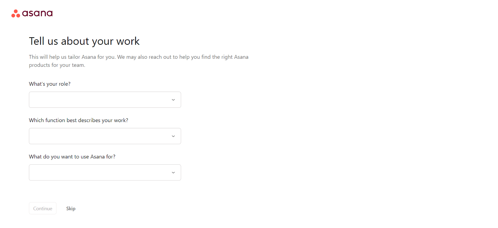
For example, Asana asks new users simple questions in the signup stage to understand their requirements and personalize their journey.
The dashboard is pre-loaded with sample tasks according to user needs. This lets them complete relevant actions easily even though they don’t know all the features yet.
Show discount and free shipping popups to hesitant customers to nudge them to complete the purchase.
Run a point-based and tiered loyalty program to improve purchase frequency, retention, and advocacy. Personalize the rewards based on customer data and ensure they can collect and redeem the points easily.
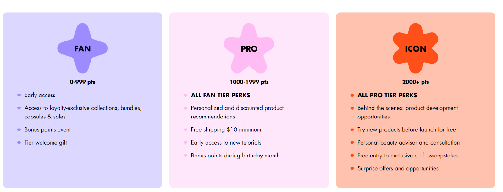
For example, the E.L.F Cosmetics loyalty program “Beauty Squad” offers customized rewards like personalized and discounted product recommendations, personal beauty advisor, bonus points in birthday month, etc.
Use data to refine touchpoints
Enrich customer profiles with additional data to refine touchpoints. It shows your most profitable channels, most valuable customers, and urgent areas of improvement.
Track page views, time-on-site, and bounce rate to understand website behavior. Heatmaps, session recordings, and click tracking will show you finer frictions you may have missed earlier. You must also see which sources drive the most traffic and click-through rates.
If the data shows that customers keep searching the FAQ section for a specific query, it may indicate a lack of depth. Add a chatbot to improve the UX. The chatbot should give answers that are relevant to that specific customer.

For example, Amazon’s chatbot Rufus can personalize product recommendations and answer queries based on historical data, and purchase insights.
Optimize CTAs for better engagement
A persuasive CTA is one of the deciding factors in whether a user will take the desired action. But when can it convince a user to explore your product and give you a chance? When it conveys your expertise in solving their unique challenges, they will only engage with your website content, explore your products, and buy them.
CTAs should convey, in clear terms, exactly what the customer will get by clicking on it. Use strong action verbs. they should be relevant to the stage the user is at in their journey.
Send free trial users reminders about the end of their trial period with a CTA to the paid plans. Add discounts to make the deal sweeter. Similarly, existing customers should receive communication with CTAs like “Renew Your Plan.”
Use bold and high-contrast colors to make your call-to-action buttons stand out. They should have plenty of white space and be large enough to grab attention without overwhelming the customer. Place them strategically in newsletters, email marketing, and website pages.

For example, here is a marketing email from Grammarly. The white button with green font against the email’s black background makes it easily noticeable. It’s also strategically placed, right after the benefits of Grammarly Pro.

Semrush also has strong and cleverly placed CTAs all over their websites. For example, on their landing page, they feature their CEO and take a humorous approach to highlight the platform’s unique features.
The brand’s confidence in its tools, combined with the feature list will make you curious. And right there, you will see a CTA button, inviting you to explore more. Naturally, you will be tempted to click on it.
Leverage A/B testing for improvements
Customers won’t always behave exactly how you expect them to, no matter how data-driven your approach is. To ensure a good response, running A/B testing for different journey variants is a must.
Here are some elements you should be testing:
- Landing page layouts and visuals
- CTAs
- Instagram, Facebook, TikTok, and LinkedIn post ideas
- Ad copy and design elements
- Navigational flow
- Signup forms
- Pricing display (month-based, annual, or both)
- Payment options
- Popups
- Loyalty and referral program rewards
Create benchmarks for each after conducting competitor analysis. Then measure each variant’s response against it and choose the ones driving the best results.
Streamline navigation for smoother flow
Make navigation as easy as possible so users keep engaging with your platform. It should follow a logical flow and be inclusive. Maintain jargon-free language with a simple and minimal design. Also, avoid overwhelming the user.
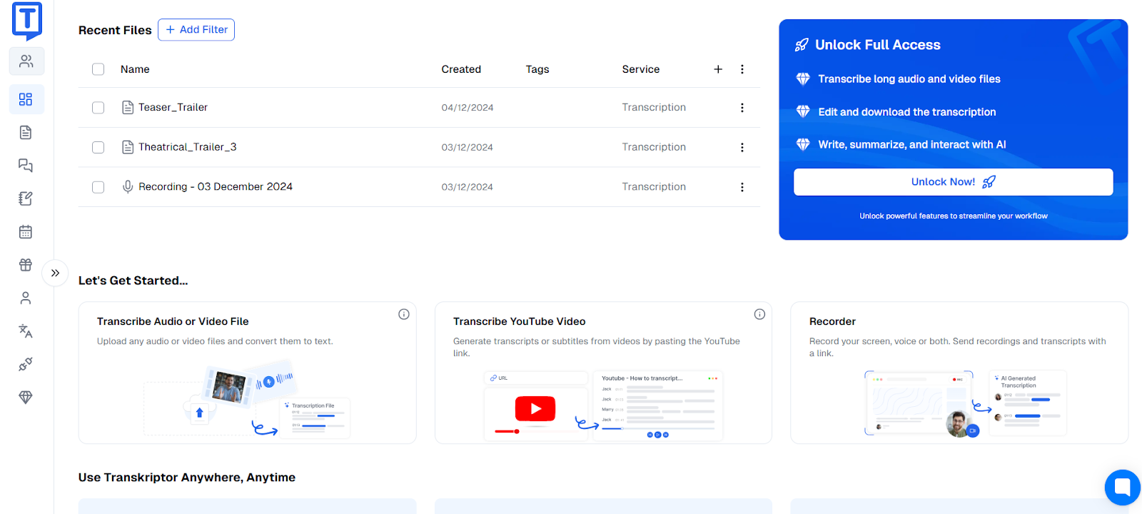
Here is Transkriptor’s dashboard. A beginner can access and navigate every tool here easily. The steps are simple: You upload your file, the platform takes a few seconds to process, and you get a customizable transcript ready.
According to WHO data, 1 out of 6 people live with significant disability. So, design navigation that accommodates neurodiverse and disabled users.
Add subtitles to the videos on the website. Let users zoom in without losing resolution. You should also add voiceovers and alt texts to your visuals. Use micro-interactions in UX design to delight customers.
Align messaging with user intent
Tailor your communication to address their specific goals and motivations at each stage of their buying journey. You must use language that directly addresses what they are searching for.
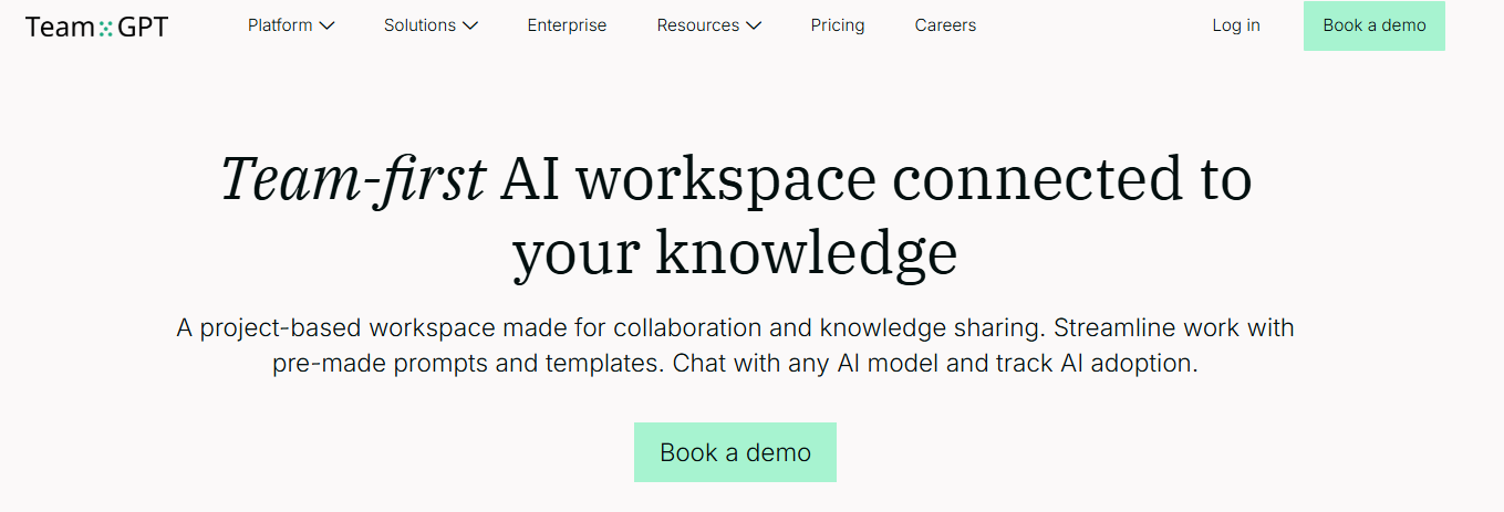
For example, Team-GPT’s target audience is companies looking for collaborative AI solutions. They want their entire team to adopt AI and streamline workflow for better productivity — and that’s what the landing page communicates.
Use keyword research tools to identify the most common phrases people use while looking for information related to your industry to reveal search intent. Optimize marketing copy, resources, and website copy with these keywords. Run SEO competitor analysis to understand how other brands match user intent.
Conclusion
No matter how amazing your products are or how glaring of a problem you solve, complicated user journeys will stop you from maximizing revenue. Even if someone buys your product once, they won’t come back if the experience isn’t smooth.
So, follow these strategies consistently. Think from the customer’s point of view, map journeys, and identify and eliminate friction points. Keep the designs simple — be it your navigation flow or marketing materials.
Finally, keep improving the touchpoints based on changing customer preferences.

Andrej Fedek is the creator and the one-person owner of two blogs: InterCool Studio and CareersMomentum. As an experienced marketer, he is driven by turning leads into customers with White Hat SEO techniques. Besides being a boss, he is a real team player with a great sense of equality.