Your nonprofit’s website isn’t just a virtual brochure, it’s your most powerful tool for inspiring action and driving impact. But here’s the catch, if your site isn’t engaging, it’s missing the mark. Imagine a visitor landing on your page, eager to help but quickly overwhelmed or underwhelmed. That’s a lost opportunity.
To truly connect with supporters, amplify your mission, and convert visits into meaningful involvement, your website must captivate and motivate from the get-go. Dive into these top strategies for enhancing user engagement, and turn your nonprofit site into a dynamic hub that not only attracts but actively involves your audience in your cause.
Table of Contents
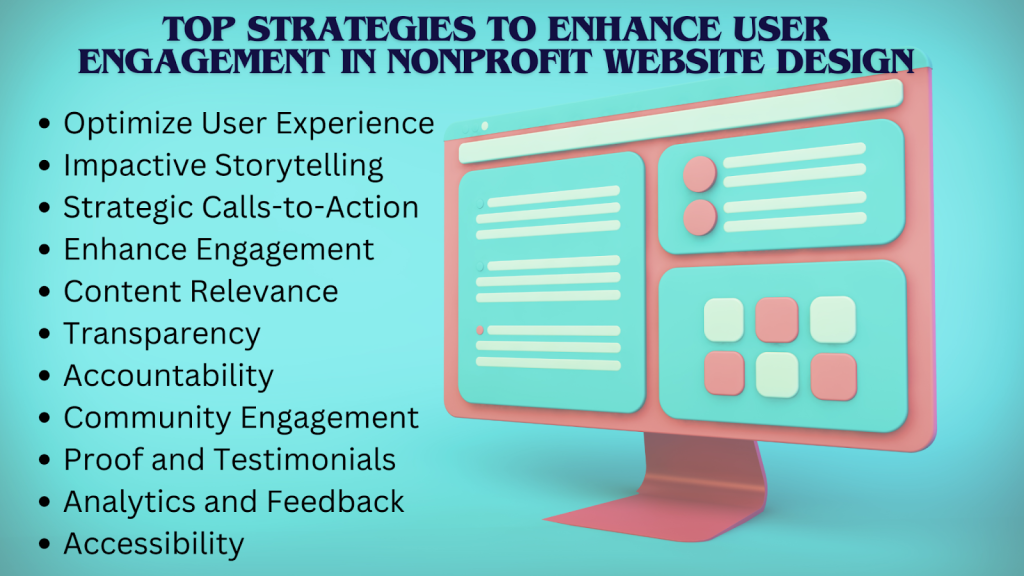
- Optimize User Experience with Intuitive Design
- Leverage Impactful Storytelling
- Implement Strategic Calls-to-Action (CTAs)
- Enhance Engagement with Interactive Features
- Ensure Content Relevance and Freshness
- Showcase Transparency and Accountability
- Foster Community Engagement
- Utilize Social Proof and Testimonials
- Incorporate Advanced Analytics and Feedback
- Prioritize Accessibility and Inclusivity
- Conclusion
- Frequently Asked Questions (FAQs)
Optimize User Experience with Intuitive Design
A well-organized website with intuitive navigation is crucial for retaining users, as online consumers are less likely to return after a bad experience. Prioritize a clear, hierarchical menu that makes essential pages accessible within a few clicks.
Coupled with this, mobile responsiveness is essential, with 16% of mobile internet users leaving a site if it doesn’t load within 3 seconds, optimizing mobile site performance is crucial for retaining visitors. Design with an approach that employs responsive techniques to ensure seamless functionality across all devices, and test extensively on various screens to guarantee compatibility.
Leverage Impactful Storytelling
Make your content more engaging by adding captivating case studies and visual stories. Create detailed case studies that include personal stories, before-and-after scenarios, and real quotes to help create an emotional connection with your audience.
Add to the narratives high-quality visuals, including professional images and videos, enhancing your storytelling. Add infographics that simplify complex data and create an immersive experience which elicits a response from the visitors. For optimal results in your nonprofit website design, integrating these elements can significantly boost engagement.
Implement Strategic Calls-to-Action (CTAs)
Effective CTAs will drive results in engagement and conversions, so placing calls-to-action above the fold provides the best visibility in a non-intrusive way. Make sure the color of the CTA contrasts with that of the rest of the page, and that the placement makes sense.
Always use buttons over text links because buttons are easier to see and click on. Design the buttons in bright colors and to an extent that a user can fiddle with them easily. Also, use action words in the text so that it may facilitate going to the next step.
Enhance Engagement with Interactive Features
Interactivity through quizzes and polls can significantly boost user engagement by encouraging participation and gathering valuable insights. Include information about your mission and use user opinion polls, then analyze the response for further refinement of the content.
Adding to that, live chat and chatbot tools provide real-time support that guides users through your site and helps them with their needs while gathering feedback to continuously update and make it better.
Ensure Content Relevance and Freshness
Keep your site fresh by regularly publishing fresh content such as blogs, news, and event updates. Review and refresh older content to keep it relevant. Deliver personalized experiences by providing customers with a unique and relevant experience by automatically tailoring content based on individual preferences and behaviors using audience segmentation, dynamic content, and personally targeted email campaigns.
Showcase Transparency and Accountability
By showing transparency, depict clear impact reports using visually appealing charts and infographics to bring out your performance and financials. Provide access to these reports and make sure to give a summary to keep them informed of developments.
In the same way, show appreciation to your donors by posting their names on a donor page, updating them about the utilization of their donations, and sending thank-you emails. In this way, not only will trust be developed, but such practices will also encourage further participation.
Foster Community Engagement
Foster a sense of community by creating forums in which people can explore topics related to your mission and develop a sense of rapport and solidarity with others. Create forums with clear categories relevant to the subject matter, and moderate discussions to ensure respectful interaction. Also, use discussion prompts to foster participation among users.
Complement by displaying upcoming events and past events as part of showing continuity of activity. Give photos and highlights of past events, too, and give in-depth information to let the users be updated on any activity.
Utilize Social Proof and Testimonials
Noticeably highlight user-generated reviews on your website. Include more detailed testimonials, quotes, and photos for authenticity. Publish your social feeds and sharing options so users can share user-generated social proof through your content.
Embed your social feeds directly into your site with sharing buttons to enable easy distribution of content. Showcase user-generated content to raise engagement and increase viewership.
Incorporate Advanced Analytics and Feedback
Monitor user behavior and find trends to further refine your content and design strategies using tools. On top of this data-driven approach, add user feedback by collecting it via surveys and forms, and drive insights into use by making informed improvements.
Take the time to frequently review the feedback and conduct A/B testing to continually optimize your website’s performance so that both user behavior and direct input are driving your enhancements.
Prioritize Accessibility and Inclusivity
Ensure that the website adheres to Web Content Accessibility Guidelines and is accessible to disabled people. After that, apply best practices like alt text for images, keyboard navigation, and good color contrast for better inclusion.
Apply inclusive design using clear and easy-to-understand language, including underrepresented groups in the images shown, and be very friendly toward all users. Hence, it covers all the accessibility standards, enabling you to make a website that looks attractive to a wide category of users, thereby promoting an inclusive digital world.

Conclusion
By applying these strategies, you can significantly boost user engagement on your nonprofit website. From intuitive design to compelling storytelling and interactive features, each aspect is crucial for a standout online presence.
Ready to enhance your nonprofit website? Implement these strategies to transform your site into a dynamic platform that significantly boosts engagement and maximizes impact.
Frequently Asked Questions (FAQs)
- How can I boost user engagement on a tight budget?
Great content trumps all else and most of it can be enhanced with free tools. Tell a better story, use case studies, complement your text with images, videos, or infographics, and add interactive elements such as polls. Refreshing content and calls to action can also drive more engagement at little to no cost.
- What are the key practices for designing an engaging nonprofit website?
Ensure ease of navigation, provide great visuals, and set clear CTAs. Ensure the site is mobile-friendly and accessible, and make it interactive. Keep updating and personalizing the content for consistently engaging users.
- How do I measure if my engagement strategies are working?
Use analytics to count page views, bounce rates, and other metrics. Then, monitor the efficacy of CTAs and gather feedback from users through surveys to continuously improve your methods for engagement.

Andrej Fedek is the creator and the one-person owner of two blogs: InterCool Studio and CareersMomentum. As an experienced marketer, he is driven by turning leads into customers with White Hat SEO techniques. Besides being a boss, he is a real team player with a great sense of equality.
