When it comes to evaluating content performance, it’s hard to know what’s working and what isn’t. You can easily get caught on a hamster wheel of content production without really knowing who it’s for or if it’s producing results. This is why you need a data-driven content strategy. Using real insights from your users will help you make marketing decisions quickly. Even better, your content will drive results.
Research has shown that organizations that use data-driven strategies see 5–8 times more ROI than businesses that don’t.
So, where do you begin?
It’s easy to say “look at the data’’ but the truth is, user data can be convoluted and confusing. How do you interpret the data to get the information you need?
Below, we outline the benefits of data visualization, how to use it to create original content, and some tools to get started.
Data visualization is the process of turning raw data into visual formats like charts, dashboards, heatmaps, and infographics so patterns become easier to spot and explain. In content marketing, it supports a data-driven content strategy by helping teams understand audience behavior, identify trends, improve decision-making, and create original visual content that is more engaging, shareable, and conversion-focused.
Table of Contents
The benefits of data visualization
If you’re like most content marketers, your life is filled with giant spreadsheets with many tabs. Maybe you have a database you occasionally draw a report from.
Sometimes, you can find what you need quickly. Sometimes you can’t. Sometimes, you forget you have the information already and spend weeks trying to re-compile it. Or maybe you have all of the data in one spot, but you have no idea how to start analyzing it into something useful.
This is where visualization tools can really help you with your data-driven content strategy.
Data visualization allows you to take all of your data and transform it into a visual format that is much easier to interpret.
Suddenly, you’re able to:
- Recognize beneficial correlations
- Target audience demographics
- Learn engagement metrics
- Find new audiences
- Identify patterns
- Locate trends
- Spot errors
Data visualization allows marketing teams to make better business decisions faster and with more confidence. Now, you’ll have a data-driven content marketing strategy instead of just going off of intuition and what everyone else is doing.
How to use visualization to create data-driven content
While visualization is a game-changer for making business decisions with data-driven insights, it’s also a goldmine for original content.
Let’s look at some examples of how to leverage visualization tools to create content that converts.
Narrative storytelling
Data tells a story. Or rather, it gives you all the plot points, and your creativity does the rest.
Incorporating the best diagram templates into your content creation significantly enhances clarity and engagement. Diagrams serve as dynamic storytelling tools that can illustrate complex ideas swiftly. By blending compelling visuals with insightful data, marketing teams craft more engaging narratives, boosting comprehension and interest.
Cognitive psychologist Jerome Bruner famously discovered that the human brain is 22 times more likely to remember facts if they are part of a story.
You can present the facts in a dry, technical visual. But chances are, few will take the time to try and interpret it. And it won’t make a very lasting impression even if they do.
This is why you want to focus your content on narrative storytelling and weave the facts in.
There are three storytelling approaches you can take:
Fiction: Create a scenario (based on your user data) that takes a realistic situation that your target audience can empathize with. Set the scene, present the problem, and raise the stakes. Then, swoop in with your data-backed solution.
Tell a personal story: Personal stories can be easier because it’s already written for you. You lived it, after all. The rules of fiction storytelling above still apply. Focus on how the data proved true in your own experience.
Tell someone else’s story: Case studies and testimonials fall into this category. By sharing someone else’s experience with the facts your data shows, you build trust and credibility with your potential customers.
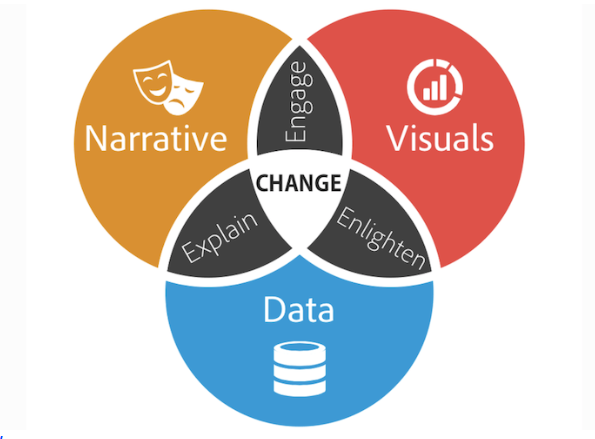
This diagram helps explain the balance in good narrative storytelling.
A narrative explains and applies the data to a relatable real-life situation. Visuals keep the audience engaged. And the data provides convincing proof to drive the point home.

Statistical reporting
Using your own data gives you an edge in creating original data-driven content. Visual statistic reports are incredibly shareable. The more readers in your industry share your research, the more backlinks you’ll earn to your own site, increasing site authority and brand trust.
Good data-driven content may have the added benefit of generating PR. If you marry storytelling with good data, your content marketing pieces may get picked up by news outlets and get a buzz larger than the target audience in your industry.
Infographics and shareable content
Much like original statistics reports, infographics and visual content formats are very shareable. Creating graphic content from your data visualization tools gives you the opportunity to massively expand your social media marketing.
Best types of data visualization tools
Before investing in visualization tools, it’s essential to ensure your underlying data is clean, consistent, and well-structured. Fragmented or siloed data will limit the accuracy of any insights you surface. Working with professional data architecture consulting services helps you build the right data foundations — so your visualization tools can actually deliver the actionable insights your content strategy depends on.
The tools that are right for you will depend on your skill set and resources, but here are the best types of data visualization tools to explore as you get started.
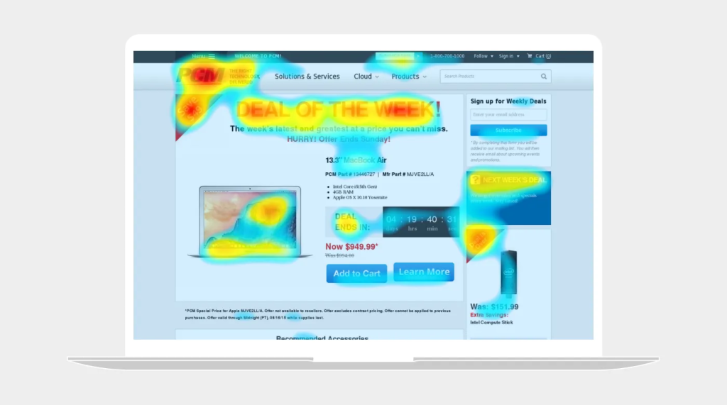
Heatmaps: Tools like heat maps from Glassbox, Hotjar, and Crazyegg allow you to create heat maps on your web pages that show you how users are interacting with your content. With these tools, you can eliminate problem areas and identify spaces with high-engagement.

Graphic design: Platforms like Piktochart and Canva have made it incredibly easy to create infographics and other visuals without being a graphic design whiz.
Dashboard tools: Power BI and Google Analytics are powerful analytics tools that allow you to track key performance indicators in real time. Additionally, Power BI helps you visualize any data and share it seamlessly.
Graphs and charts: If your needs are simple, Microsoft Excel or Google Sheets will be enough to make effective charts and graphs to share. The bonus with these tools is they are accessible to most marketing teams and therefore won’t require a huge investment in resources. What’s more, you can easily load large-scale data from any data source into spreadsheets in a matter of minutes with an automated Google Sheets connector.
Wrapping Up
Hitting your digital marketing business goals becomes much easier when you have a data-driven content strategy.
When you have the information to reach your target audience, visualizing your data enables you to create original, narrative content that’s impactful and shareable.
Choose the right data visualization tools for your skills and budget, and start leveling up your visual content creation across marketing channels.
Here’s to your success in a data-driven approach to boosting conversion rates and landing blog posts on the top spots on search engines.
What is data visualization in content marketing?
Data visualization in content marketing means turning raw numbers and user insights into visual formats like charts, dashboards, heatmaps, and infographics.
This makes patterns easier to understand and helps marketers create content based on evidence instead of guesswork.
Why is data visualization important for a data-driven content strategy?
It helps marketing teams quickly spot trends, audience behavior, engagement patterns, and weak points in their content performance.
With clearer insights, brands can make faster decisions, improve targeting, and build a more effective data-driven content strategy.
How can data visualization help create better content?
Visualized data can reveal useful story angles, highlight original findings, and show what topics or formats resonate with your audience.
It can also support narrative storytelling, statistical reports, and infographics that are more engaging and easier to share.
What types of data visualization tools are commonly used?
Common options include heatmap tools, dashboard platforms, graphic design tools, and spreadsheet-based charts.
Depending on your needs, marketers often use tools for real-time analytics, user behavior tracking, infographic design, or basic chart creation.
Can data visualization improve engagement and conversions?
Yes, because visual content is easier to process and often more compelling than walls of raw data or plain text alone.
When marketers combine clear visuals with useful insights and strong storytelling, content becomes more engaging, shareable, and conversion-focused.

Kelly Moser is the co-founder and editor at Home & Jet, a digital magazine for the modern era. She’s also the content manager at Login Lockdown, covering the latest trends in tech, business and security. Kelly is an expert in freelance writing and content marketing for SaaS, Fintech, and ecommerce startups.
