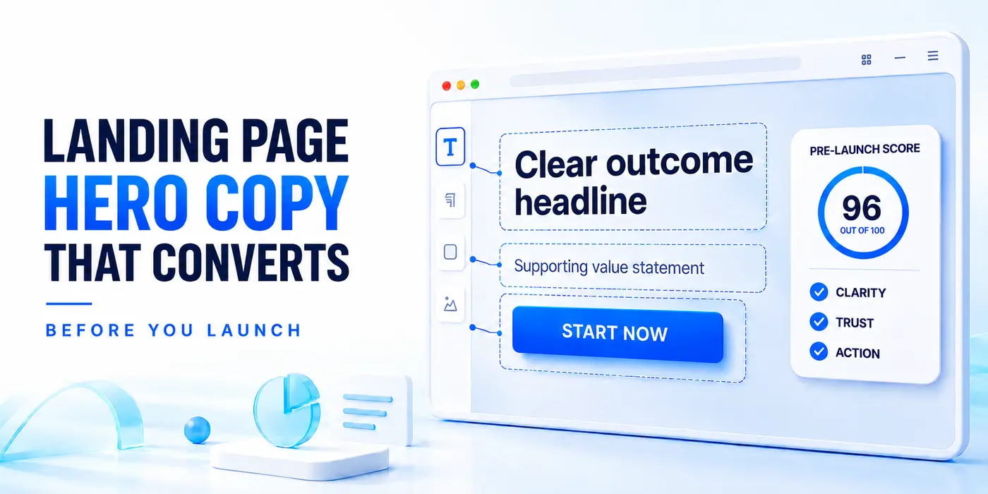
Strong landing page hero copy should be approved before a project moves from wireframe to final visual design. The headline becomes a placeholder, the subheadline a late-stage explanation, and the CTA comes from a familiar list: Learn More, Get Started, or Contact Us.
That sequence creates avoidable rework. Once the layout is approved, copy has to fit the design. The result may look polished while leaving visitors to decode the offer, audience, and next step.
For agencies and B2B teams, the hero is a compact conversion system: a headline that communicates relevance, a subheadline that reduces uncertainty, and a CTA with a specific next step.
Strong landing page hero copy helps visitors immediately understand what the offer does, who it is for, why they should trust it, and what to do next. Build the headline around one concrete outcome or pain point, use the subheadline to resolve the next objection, and make the CTA describe the exact commitment. Approve and score these three elements before design lock so, the layout supports the message instead of forcing copy into a finished template.
The Buying Decision Behind the Landing Page Hero
A useful hero does not summarize the company. It addresses the first decision a visitor is making. That might be geographic fit for a local service, workflow fit for SaaS, or credibility for a high-consideration B2B offer.
Before drafting, ask the client team three questions:
- What outcome brought the visitor to this page?
- What is the strongest reason to believe the offer can deliver it?
- What is the smallest useful action the visitor can take next?
These answers serve as the raw material for the hero and prevent a common agency problem: combining all possible messages into a single oversized section. Before the layout is approved, teams can run the assembled page through PageKiss’s conversion scorer to check clarity, credibility, and conversion signals while the copy is still easy to revise.
One Landing Page Hero Pattern Is Enough
High-performing SMB pages tend to use concrete patterns rather than broad brand statements. The right pattern depends on what dominates the buying decision.
| Pattern | Best Fit | Example |
|---|---|---|
| Outcome + Audience | Vertical SaaS or specialized B2B services | “Faster invoice approvals for construction teams” |
| Outcome + Location | Local services and regional campaigns | “Commercial HVAC repair across North Dallas” |
| Outcome + Timeline | Urgent or time-sensitive services | “Launch your customer portal in four weeks” |
| Pain Reversal | Categories with a familiar frustration | “Security reviews without the spreadsheet chase” |
| Credibility First | Legal, financial, medical, or technical services | “SOC 2 consultants trusted by 200+ SaaS teams” |
| Price or Offer Anchor | Productized services and low-friction entry offers | “Get a conversion audit for $0” |
A strong landing page hero uses a single focused pattern rather than combining several broad brand claims. If the headline leads with speed, do not force credentials, audience, features, and price into the same sentence. Move supporting information to the subheadline or a nearby proof element.
Write the Headline for Fast Comprehension
Specific language usually beats category language. “Automate your finance operations” may be correct, but “Close the books without chasing spreadsheet updates” gives the reader a recognizable situation and the design team a clearer direction for supporting proof.
When reviewing headline options, use four filters:
- Could a competitor use the same line unchanged?
- Does it name an outcome, problem, audience, location, timeline, or measurable offer?
- Can someone understand it without reading the navigation?
- Is it short enough to work on mobile without becoming a paragraph?
If the answer to the first question is yes, the copy is probably still generic.
Use the Subheadline to Resolve the Next Objection
The subheadline should not restate the headline. It should answer the next question it creates.
If the headline promises speed, explain what is delivered and what makes the timeline credible. If it leads with a specific audience, clarify the use case. If it leads with a pain reversal, show how the process is different.
For example:
Headline: Close the books without chasing spreadsheet updates.
Subheadline: Connect approvals, reconciliations, and reporting in one workflow built for multi-entity finance teams.
The headline earns attention; the subheadline defines scope and fit. Together, they let the visitor self-qualify without turning the hero into a product specification.
Make the CTA Describe the Actual Commitment
The CTA completes the landing page hero by telling visitors exactly what happens after the click.
“Get Started” could open an account, book a call, or launch a checkout. “See a Sample Report,” “Build My First Page,” or “Book a 20-Minute Demo” sets a clearer expectation.
Match the CTA to the visitor’s stage and the sales motion. Product-led SaaS may justify a direct trial CTA. A complex B2B service usually needs a lower-friction step, such as viewing an example or requesting a scoped assessment.
If a secondary CTA is necessary, it should support the same decision. “Start Free” paired with “Watch 90-Second Demo” works because both help the visitor evaluate the product. Unrelated CTAs signal that the page lacks a primary goal.
A Pre-Launch Score for the Landing Page Hero
Review the hero before the page is handed off for final build. Use a simple scoring check to limit subjective feedback:
Score each item from zero to two:
- The offer is understandable without scrolling.
- The copy identifies a specific outcome or pain.
- The intended audience can recognize itself.
- The page provides a credible reason to believe the claim.
- The CTA describes a clear next step.
- The message still works in a mobile-width layout.
A low score is a messaging problem, not a typography problem. Teams can also run the assembled page through PageKiss’s conversion scorer to evaluate conversion and credibility signals before the URL goes live.
Build the Design Around Approved Copy
Once the copy is approved, the visual hierarchy becomes easier to defend. The headline determines the space it needs, the subheadline sets the supporting width, and the CTA defines the primary interaction. Proof can reinforce the promise rather than fill unused space.
This order also makes approvals cleaner. Stakeholders can evaluate the message before reacting to colors or imagery. Designers receive real content, and copywriters are not asked to compress a value proposition into a component sized around lorem ipsum. That sequence matters most on a full rebuild, where dozens of pages get locked at once. Teams running a B2B website revamp usually sign off messaging for the core templates before any design work starts, for the same reason.
The best pre-launch hero is rarely the cleverest. It makes the offer, relevance, proof, and next step obvious before the visitor has a reason to leave.
What is landing page hero copy?
Landing page hero copy is the primary message visitors see before scrolling, usually consisting of a headline, subheadline, and call to action.
Its purpose is to explain the offer, establish relevance, reduce uncertainty, and guide visitors toward one clear next step.
What should a landing page hero section include?
A landing page hero should include a specific headline, a supporting subheadline, and a CTA that explains what happens after the click.
Relevant proof, such as a customer result, review score, client logo, or trust statement, can support the message without overcrowding the section.
How long should a landing page headline be?
A landing page headline should be short enough to understand quickly and focused on one outcome, audience, pain point, timeline, or offer.
There is no universal word limit, but the headline should remain easy to scan on mobile and should never become a paragraph.
Should hero copy be written before the landing page is designed?
Yes. Writing and approving the hero copy first allows the layout, visual hierarchy, proof elements, and CTA placement to support the actual message.
Starting with design often forces copywriters to compress a strong value proposition into a component built around placeholder text.
What makes a landing page CTA more effective?
An effective CTA describes the specific action or outcome visitors can expect instead of relying on a vague label such as “Learn More.”
Phrases such as “See a Sample Report,” “Start My Free Trial,” or “Book a 20-Minute Demo” reduce uncertainty by making the commitment clear.

Andrej Fedek is the creator and one-person owner of three blogs: InterCool Studio, CareersMomentum, and Bettegi. As an experienced marketer, he is driven by turning leads into customers with White Hat SEO techniques. Besides being a boss, he is a real team player with a great sense of equality.