Visuals speak volumes in today’s overflowing email landscape. With 121 business emails bombarding users daily and attention at a premium, a well-chosen email image can be the key to getting your message read. But sharing any old email image isn’t enough. It also has to be relevant, visually engaging, and high-quality. In this blog, we’ll unveil the secrets of using images to transform your email communication. We’ll also share expert tips on choosing the right email images and using them effectively.
Let’s dive in.
An email image is a visual element used in marketing emails to attract attention, support the message, and improve engagement. The best email image is optimized for fast loading, mobile responsiveness, accessibility, and clear communication so readers can understand the message even if images do not display properly.
Table of Contents
The Power of Visuals in Email Communication
Here are some key reasons visuals are so powerful in email communication:
1. Increased Engagement
Emails containing images offer a nearly 10% boost to open rates and click-through rates by 42%. That’s a significant increase in engagement you can’t ignore.
2. Improved Comprehension
Visuals aren’t just eye candy — they help make information stick. People retain 65% of information presented visually, compared to only 10% of text-based information.
So, avoid the text walls and use charts, graphs, and infographics to clarify your message.
3. Enhanced Recall
Images create a lasting impression, ensuring your message resonates long after the email is closed. For example, the audience can recall optimal logo designs 15–20% better.
4. Emotional Connection
Visuals evoke emotions and build stronger connections. A study found that in the decision-making mechanism, emotion accounts for 85% of our decisions and only 15% of our logic.
5. Professionalism
High-quality visuals elevate your email’s appearance and professionalism. This is crucial for businesses and organizations trying to make a positive first impression.
For a professional email, consider using branded images, consistent color schemes, and graphics.
Need inspiration? Here’s a very simple example from Aritzia. It’s clean. It’s modern. It makes a good first impression for a welcome email.

Screenshot provided by the author
How to Craft the Perfect Email Image?
An email image can be the hero or the villain of your message. So, choose it wisely. It can grab attention, boost engagement, and drive action. But what makes the perfect email image? Here’s the blueprint:
Key Characteristics:
- Audience-appropriate: Consider your demographics and preferences. A playful cartoon might resonate with younger audiences, while a sleek infographic might suit professionals better.
- Relevance: Does the image directly connect to the email’s content? It shouldn’t only be captivating but also reinforce your message.
- Accessibility: Include descriptive alt text for all images so even those with slow connections or screen readers understand the message.
- Image quality: Avoid blurry, pixelated images. Invest in high-resolution, professional-looking images that reflect your brand’s quality. Unblur images if needed.
- Originality: Avoid generic stock images and choose unique visuals, like custom illustrations or product shots.
Choosing the Right Image:
- Image libraries: Explore free options like Unsplash and Pexels for high-quality stock photos, or invest in paid platforms like Shutterstock or Adobe Stock for a wider selection and higher quality.
- Editing and optimization: Resize images for email (generally under 1MB) and use compatible formats like PNG or JPEG.
- DIY graphics: Unleash your creativity! Design your graphics or infographics using tools like Canva or Piktochart.
Image Types and Use Cases:
- Photographs: Use high-quality photos to showcase your products, team, or real-life scenarios. They evoke emotions and create a human connection.
- Infographics: Present data and statistics in a visually appealing and easy-to-digest way, perfect for explaining complex topics.
- Illustrations: Simplify complex concepts, add personality to your brand, or create a lighthearted tone with well-crafted illustrations.
What is the Best Image Format for Email?
There’s no single “best” email format for images, as it depends on the image itself and how you want it to appear. That said, here’s a quick breakdown of the top three formats for email:
1. JPEG (.jpg)Image Format
Best for: Photographs and complex colors. Smaller file size thanks to “lossy” compression, but quality deteriorates with each edit.
Avoid it for text, logos, and graphics with sharp lines. Compression can blur these elements.
2. PNG (.png) Image Format
Best for: Images with text, logos, screenshots, and graphics with sharp lines. It supports transparency and offers superior quality but has larger file sizes.
Avoid it for photographs. The larger file size might be unnecessary for photos, and the PNG image format doesn’t handle complex colors like JPEG.
3. GIF (.gif) Image Format
Best for: Simple animations and short, looping visual elements. Great for adding movement and engagement to your email.
Avoid it for complex images or large animations. File size can quickly become bloated.
💡Pro tip: Keep your images under 1MB to ensure smooth email delivery. Choose the format based on your image’s content and prioritize quality while keeping file size reasonable.
Best Practices for Using Email Images
Here are some best practices for including images in email campaigns to advance your email marketing approach.
1. Use Image Alt Text
Alt text, also known as alternative text, offers a written description of an image for those who can’t see it. This includes people with visual impairments using screen readers and email clients that block images by default.
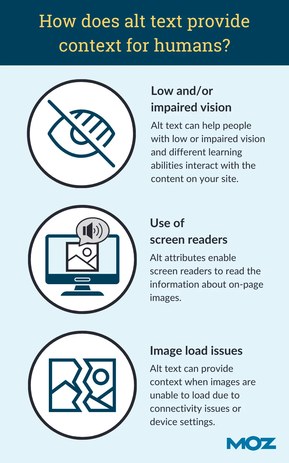
Alt text not only improves accessibility but also improves your SEO, as email clients and search engines can index the alt text to understand the email content.
Briefly describe the image clearly and concisely. Use relevant keywords, but avoid keyword stuffing.
For example, instead of “Image of a dog,” use “A happy golden retriever playing fetch in a park.”
💡Pro tip: There’s no strict character limit for alt text in email images, but it’s best to keep it concise, aiming for around 125 characters, including spaces.
2. Align Images and Subject Lines
The images you use in your emails should go hand-in-hand with your subject line. It’s essential that whoever receives the email understands what the email is about without even reading the text.
The key benefits of aligning email images and subject lines are:
- Better engagement: Images can grab attention and encourage readers to delve deeper into the email.
- Increased open rates: Emails with relevant images and subject lines are more likely to be opened.
- Improved brand recall: Consistent visual identity strengthens brand recognition.
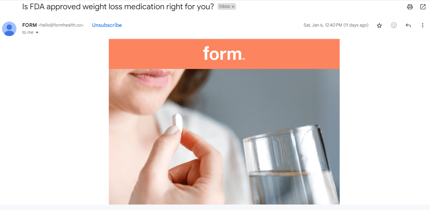
Here’s a great example to model from Form Health. The subject line says, “Is FDA-approved weight loss medication right for you?”
Screenshot provided by the author
So we assume the image — and the text — must have something to do with Mounjaro, Wegovy, Zepbound, or one of the medications they offer. Indeed, we find the image of a woman taking a pill alluding to taking medication.
If the image was something completely unrelated to what Form Health offers, subscribers might consider it misleading and report it as spam.
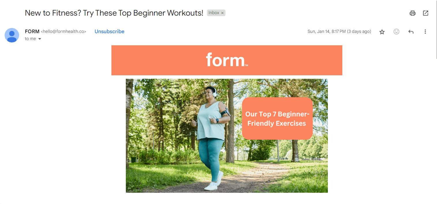
In this other example, the subject line of their email says, “New to Fitness? Try These Top Beginner Workouts!” so it wouldn’t make sense for them to have chosen an image of a dog eating snacks.
Screenshot provided by the author
Considering that they are sharing exercises for newbies, they also didn’t choose the image of a muscular person who clearly has been going to the gym for years. Consistency is important, so the image of a middle-aged lady jogging in a park makes a lot of sense.
So, what can you learn from Form Health here? When in doubt, use images to match the message you want to send.
3. Maintain Image-to-Text Ratio
Striking a balance between the amount of image content and text content in your email is a crucial step in boosting conversion rates. While visuals can grab attention, too many images can trigger spam filters or be blocked by email clients.
Ensure your text conveys the core message, using images to supplement and enhance it. Aim for a text-to-image ratio that prioritizes clear communication.

Screenshot provided by the author
For example, look at this webinar email sent by Hootsuite, where they have shared a large hero image showcasing what the webinar is about, followed by concise bullet points highlighting its key details.
Naturally, the reader isn’t overwhelmed, and the eyes seamlessly navigate down the email to the call-to-action.
Remember, the ideal ratio might vary depending on your email content and audience.
For instance, a data-heavy report might benefit from a more text-focused approach, while a visually-driven infographic can be effective for specific purposes.
4. Focus on Color Psychology
Color psychology studies how different colors evoke certain emotions and reactions. The strategic use of color in your images can help connect with your audience deeper and influence their behavior.
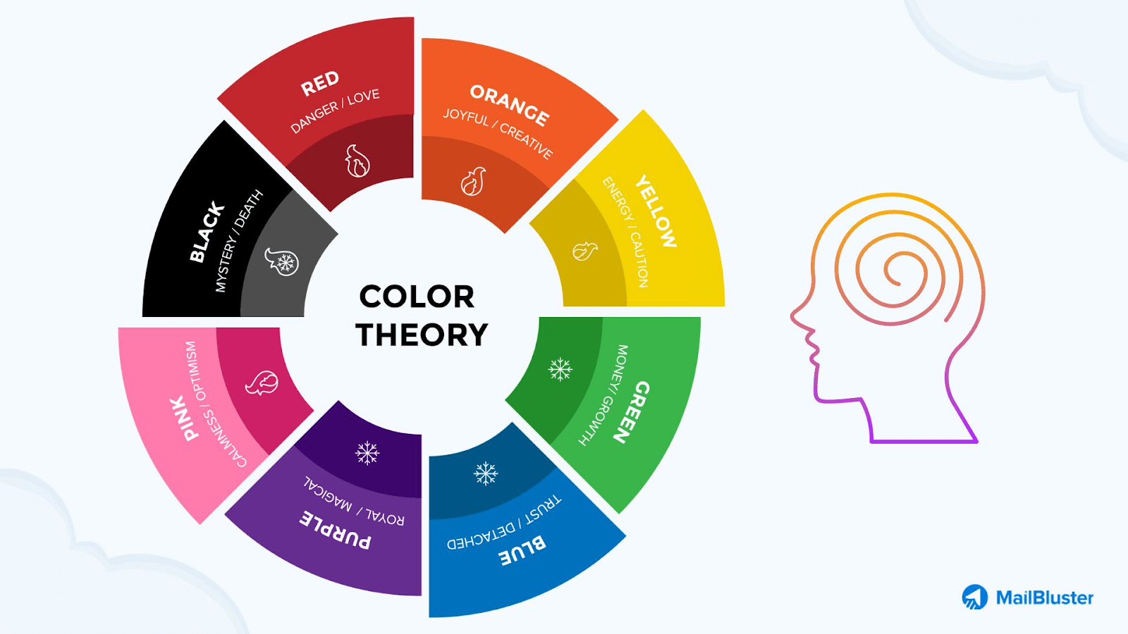
Consider your target audience and the message you want to convey when choosing colors.
For example, if you’re an eco-friendly clothing brand targeting young adults, consider using calming greens and earthy browns to convey sustainability and a connection to nature. This aligns with your audience’s values and complements your brand identity.
4. Check your Image Dimension, Size, and Format
Images in email marketing can prove powerful, but using them effectively is important to avoid frustrating your email recipients.
For optimal display, ensure your images are no wider than 600 pixels.
Large image file sizes can slow down loading times, leading to frustrated recipients. Aim for images under 1MB. A simple tool like TinyPNG can help you compress those large files without sacrificing quality.
Use JPEG for photos and PNG for graphics. For vibrant photos, JPEG is your friend. But for logos, infographics, or anything with transparency, PNG is the way to go.
5. Mobile Responsive
Ensure your email image displays correctly and works well on all devices, especially smartphones and tablets.
With more people checking emails on mobile devices, an unoptimized email image can be frustrating and lead to poor user engagement. Use a responsive email template and test your email before sending it for a seamless experience across all devices.
Ways of Image Embedding in an Email Campaign
The table below demonstrates different ways of adding images to an email campaign, along with the advantages and disadvantages of each method.
| Method | Description | Advantages | Disadvantages |
| Drag-and-Drop | Simplest method, no coding is required | Easy to use, intuitive, widely supported | Limited control over image size and placement, potential security concerns with some email clients |
| Linked Images | Images hosted on a web server, linked to in HTML code | Smaller email size, better deliverability, flexible control over image size and placement | Requires image hosting, may not work if the recipient’s email client blocks external images |
| Content ID (CID) Embedding | Images attached to email, referenced by content ID in HTML code | Images displayed directly in email, works even with blocked external images | More complex to set up, requires basic HTML knowledge, larger email size |
| Inline Embedding (Base64 Encoding) | Images encoded as text within HTML code | No external hosting required, can’t be blocked by email clients | Very large email size, poor accessibility, not widely supported by all email clients |
Wrapping up
Powerful visuals can be the secret weapon in your email marketing arsenal.
By carefully choosing email images that are relevant to your message, visually appealing, and evoking specific emotions like trust or excitement, you can cut through the noise of text-heavy emails and grab attention in a way words alone can’t.
Ready to unlock the transformative power of visuals? Start by choosing the perfect email images today and see your results!
What is an email image?
An email image is any visual element used inside an email to support the message, attract attention, and improve engagement. It can be a photograph, infographic, illustration, logo, screenshot, or animated GIF.
What is the best image format for email?
The best image format for email depends on the type of visual you are using. JPEG works best for photographs, PNG is ideal for logos, text, and graphics with sharp lines, and GIF is useful for simple animations.
Why is alt text important for an email image?
Alt text helps people understand an email image when images do not load or when a screen reader is being used. It also improves accessibility and gives email clients more context about the content of the image.
How many images should I use in an email?
There is no fixed number, but your email should keep a healthy balance between images and text. Too many images can hurt readability, trigger spam filters, or create loading issues, so the text should still communicate the core message clearly.
What size should an email image be?
For better performance, an email image should generally be no wider than 600 pixels and ideally stay under 1MB in file size. This helps emails load faster and display more reliably across different email clients and devices.
Why should an email image be mobile responsive?
A mobile responsive email image adjusts properly across phones, tablets, and desktops. Since many people open emails on mobile devices, responsive visuals help prevent broken layouts, slow loading, and poor user experience.

Jugraj is a freelance content and copywriter from Delhi, India who’s great at writing compelling content that converts. When not writing, you can find him reading thoughtful books and engaging in socio-cultural discussions, which fuels his creativity.
