In the last few years, we’ve seen parallax scrolling make it into mainstream website design trends. Numerous blogs and e-commerce stores feature the style. When elements move at different speeds on the page, it adds interest for the user and engages them.
Adobe dug into user engagement and discovered about 38% of people stop using a website if it’s unattractive. Parallax scrolling adds another element to your design that gives it an upscale, planned look. It’s attractive in most cases.
As with anything, there are pros and cons to using parallax in your designs. Here are some things to consider when deciding if it’s still a relevant trend:
Table of Contents
1. Pro: Offers a Popular Trend
Rather than clicking, people can scroll. This works particularly well on mobile devices. Parallax scrolling remains popular this year and will likely keep its popularity in the future.
While trends do come and go, the number of sites implementing varied timing on scrolling increases from week to week. Expect to see this as an ongoing trend over the next few years.

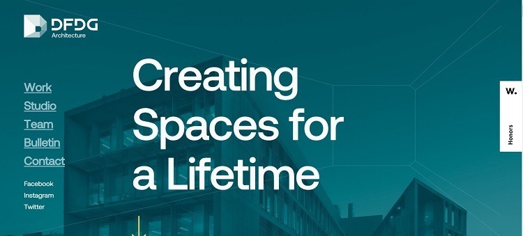
DFDG Architecture uses parallax scrolling to emphasize their capabilities. As you move down the page, letters slide in at different speeds, while the background images move more slowly. The overall effect is quite classy and elegant.
2. Con: May Have Slower Load Speeds
One drawback of parallax scrolling is that it can take longer to load than simpler designs. Scripts influence the load times, which can be a drag for people who aren’t on high speeds or use older computers with less high-definition capability.
Studies show people won’t wait around for a site to load. If your bounce rates are above where you want them to be, consider reducing or eliminating parallax scrolling to speed up the page. Conduct some A/B testing and see if your bounce rates improve.
3. Pro: Holds Visitor Interest
Parallax scrolling grabs attention because it’s a bit outside the norm. There are numerous ways of implementing it. You never know what the screen might do next, so you pay close attention.
Some of the more interesting designs have elements flying in from different directions, headlines overlaying on top of images, and navbars that stay fixed. To check these out, designers use Figma mockups and compare different solutions to find the perfect one.

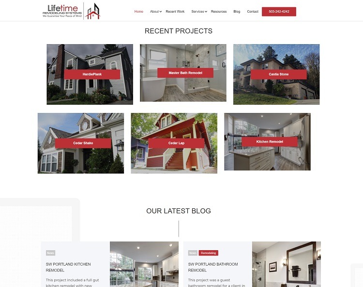
Lifetime Remodeling Systems shows a photograph of a beautiful home remodel with new siding and windows. As the user scrolls, text appears, but the image lingers for a moment. The navigation bar appears at the top and remains fixed as you move through the sections.
The site keeps things interesting by moving elements in different directions, such as page components coming in from the left side. It is a fairly simple but captivating design.
4. Con: Pulls Attention From the CTA
One drawback of parallax is that the focus turns to the images. This can draw attention from your calls to action (CTAs) or other elements you want the user to be drawn to.
The most effective CTAs target readers on a personal level. However, if the button isn’t set in stark contrast to other webpage elements, it may get lost in the mix.
Any time you add a feature to your page, pay careful attention to conversion rates. Are people still clicking on your CTA, or are they distracted?
5. Pro: Adds Depth Perception
Three-dimensional design has become more popular as screen resolutions improve. One of the big trends for 2021 is 3D looks. With parallax scrolling, you add a sense of depth perception that you don’t get from a static page.
A simple change to scrolling elements creates a high-end look you usually only get by paying thousands to a professional designer. You can add parallax elements easily as an amateur designer, though.

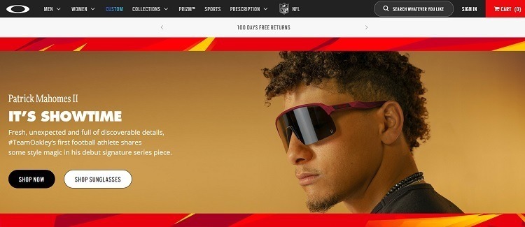
Oakley sells sportswear, such as goggles, sunglasses and snow helmets. Their homepage highlights some of their top products with vivid photographs and bright colors. As you scroll down, different images come into position at different rates, drawing the user’s eye to new arrivals.
6. Con: Could Impair Usability
There is a debate raging in design circles about whether parallax effects reduce usability. In reality, it depends on your website’s purpose. If you run a site where people come for information and want to read the text, parallax scrolling may serve as a distraction.
Think about the purpose of each page and how well-suited it is or isn’t to parallax. Run tests, poll your customers and ask for feedback. Only you can determine how well it works for your site and any particular page on your platform.
7. Pro: Parallax Scrolling Is Fun!
Some sites use parallax scrolling to turn information into something fun and interactive. You may even reduce your bounce rates by giving users tasks and letting them see what is unveiled each time they scroll down the page.
Keep in mind that scrolling can move downward or side-to-side or even stay in one spot with changing images.

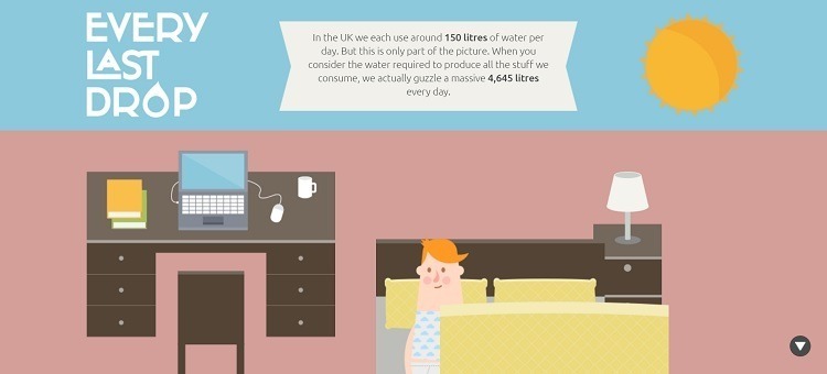
Every Last Drop explains how water is used and why we should conserve it. The site is information heavy, but the creators turn it into a game.
As you scroll, the sun rises, the character gets out of bed and short facts appear talking about water conservation. The website almost becomes a simulation as you move the character through getting ready for his day. The site is a lot of fun and keeps visitors engaged.
Is Parallax Scrolling Good for Your Website?
Ultimately, it depends. Think about the purpose of your site and how well parallax scrolling works for your audience. Test any changes you make to see how well your target audience responds. Be ready to add new features but revert to old practices if your customers respond negatively to them.

Andrej Fedek is the creator and the one-person owner of two blogs: InterCool Studio and CareersMomentum. As an experienced marketer, he is driven by turning leads into customers with White Hat SEO techniques. Besides being a boss, he is a real team player with a great sense of equality.
